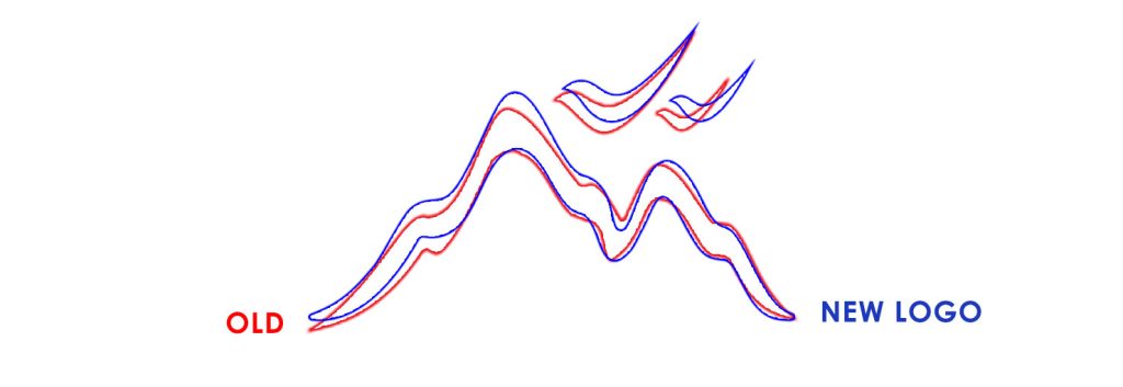
Given the well-established recognition of the Visa Mondial logo, it needed to be refined without major changes to avoid confusing the brand’s audience.
The logo refinement process began after thoroughly reviewing the logo, brand, and Visa Mondial’s audience. Issues such as lack of symmetry and poor readability at small sizes were addressed to ensure the logo was recognizable in spaces like social media.
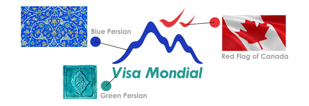
Additionally, efforts were made to create a more modern appearance that aligns with the brand’s current visual identity. Throughout this process, key elements and the core visual identity of the logo were preserved, ensuring that the new logo remains familiar and recognizable to the audience.
With these changes, the new logo retains its originality and meets the evolving needs of the audience, offering a more up-to-date and appealing experience.


